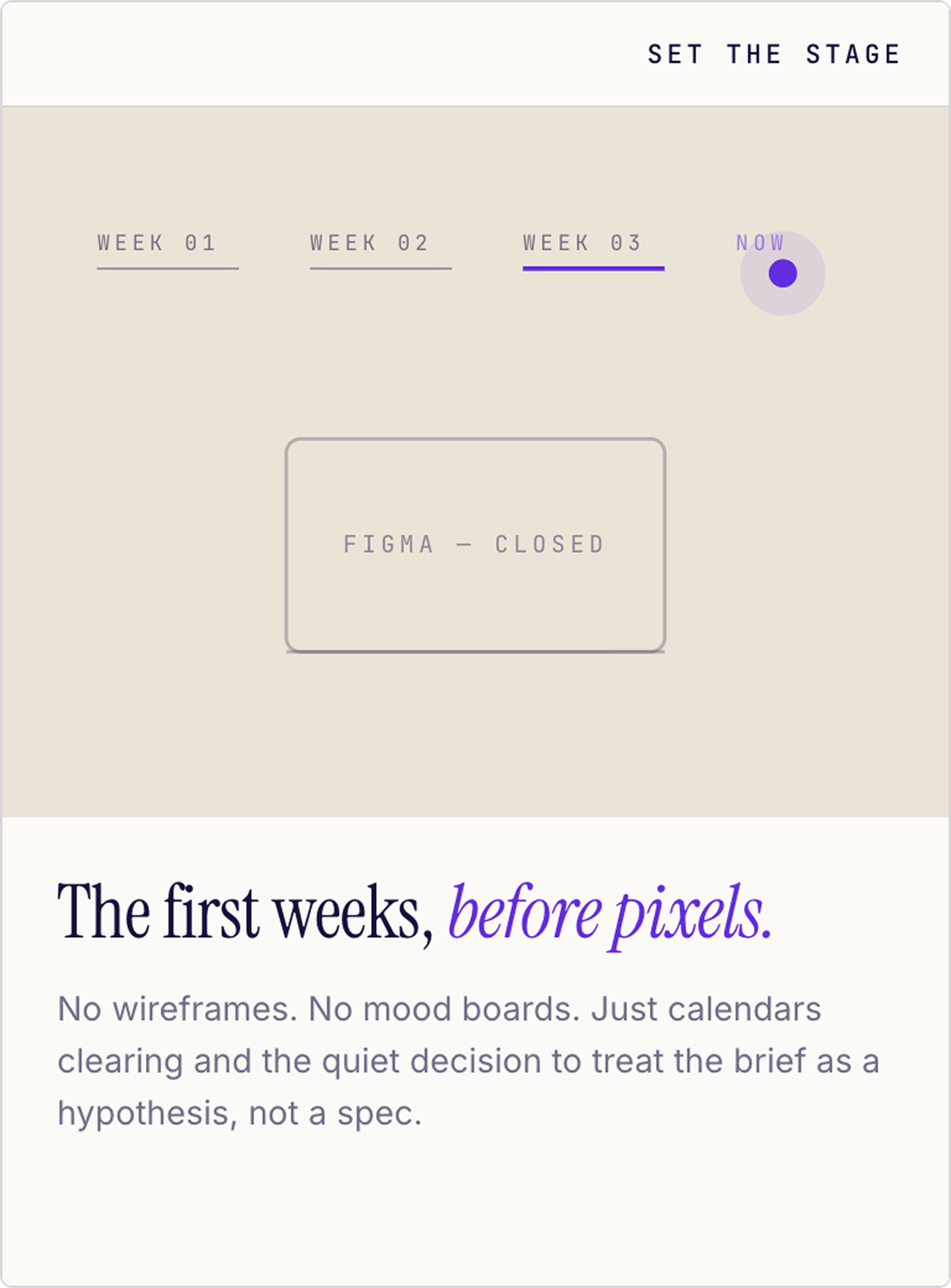
VineBrook Homes is a real estate company specializing in acquiring, renovating, and leasing single-family homes. While their operations were strong, their digital tools lacked consistency, creating a fragmented experience across customer platforms, internal dashboards, and Salesforce tools.
VineBrook's users were failing at the two moments that mattered most, finding a home and managing one.
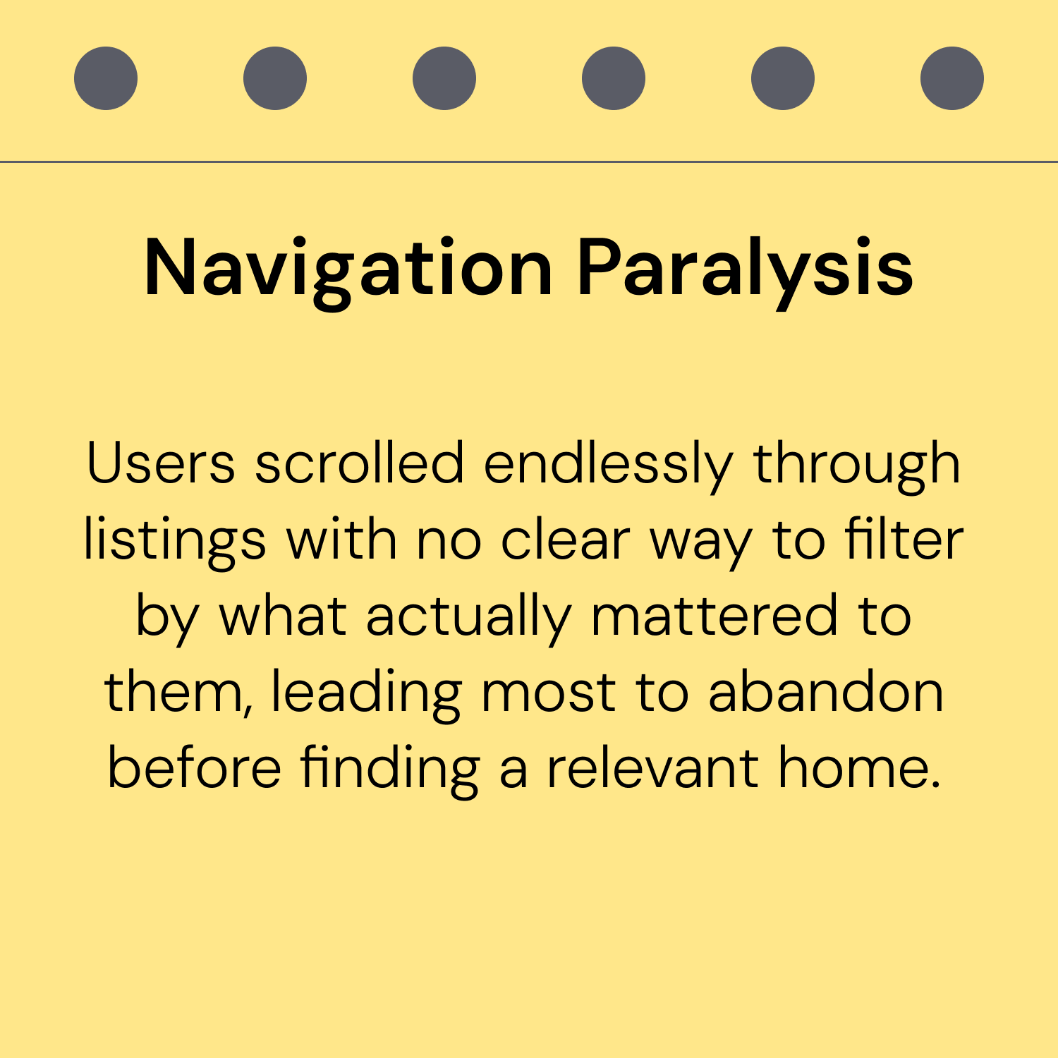
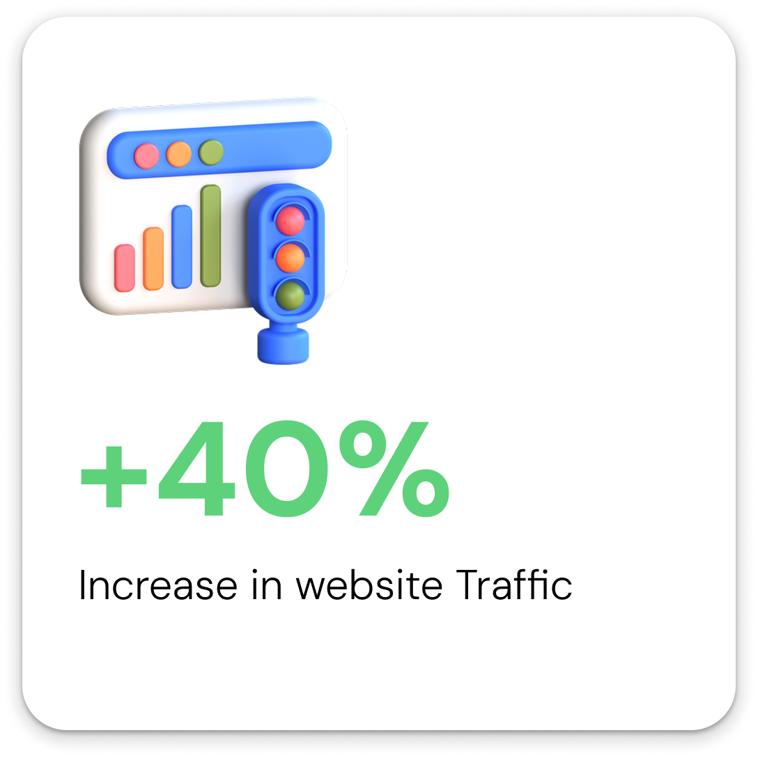
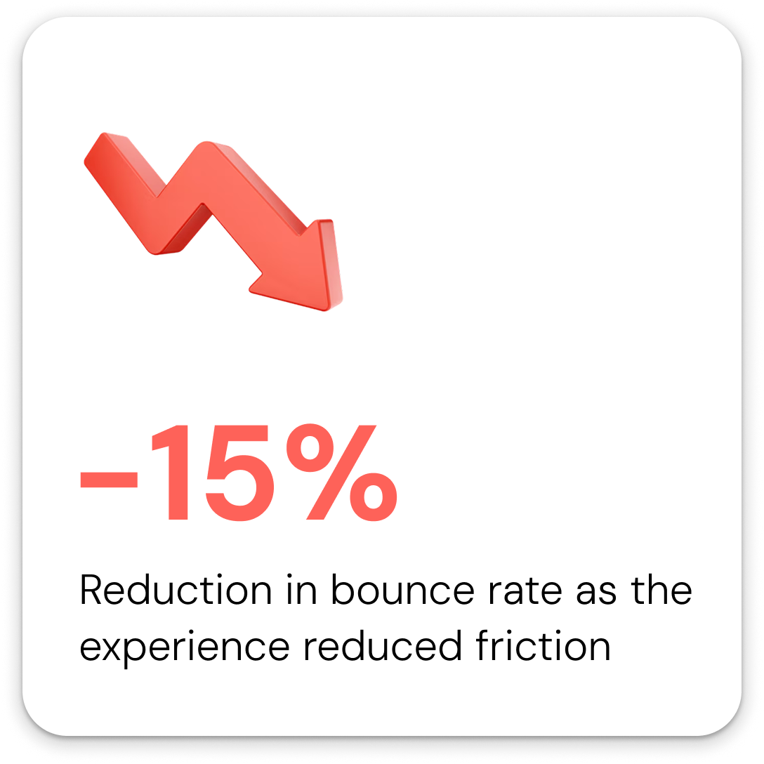
On the website, prospective renters got lost in endless scroll with no clear path to discovery or action.
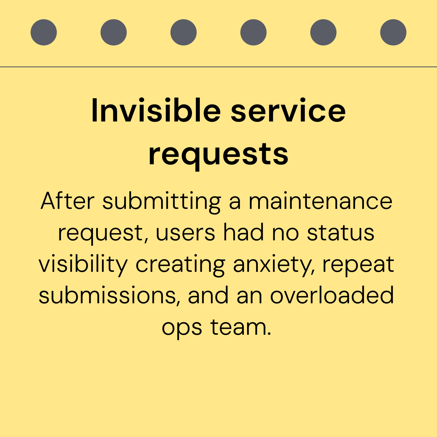
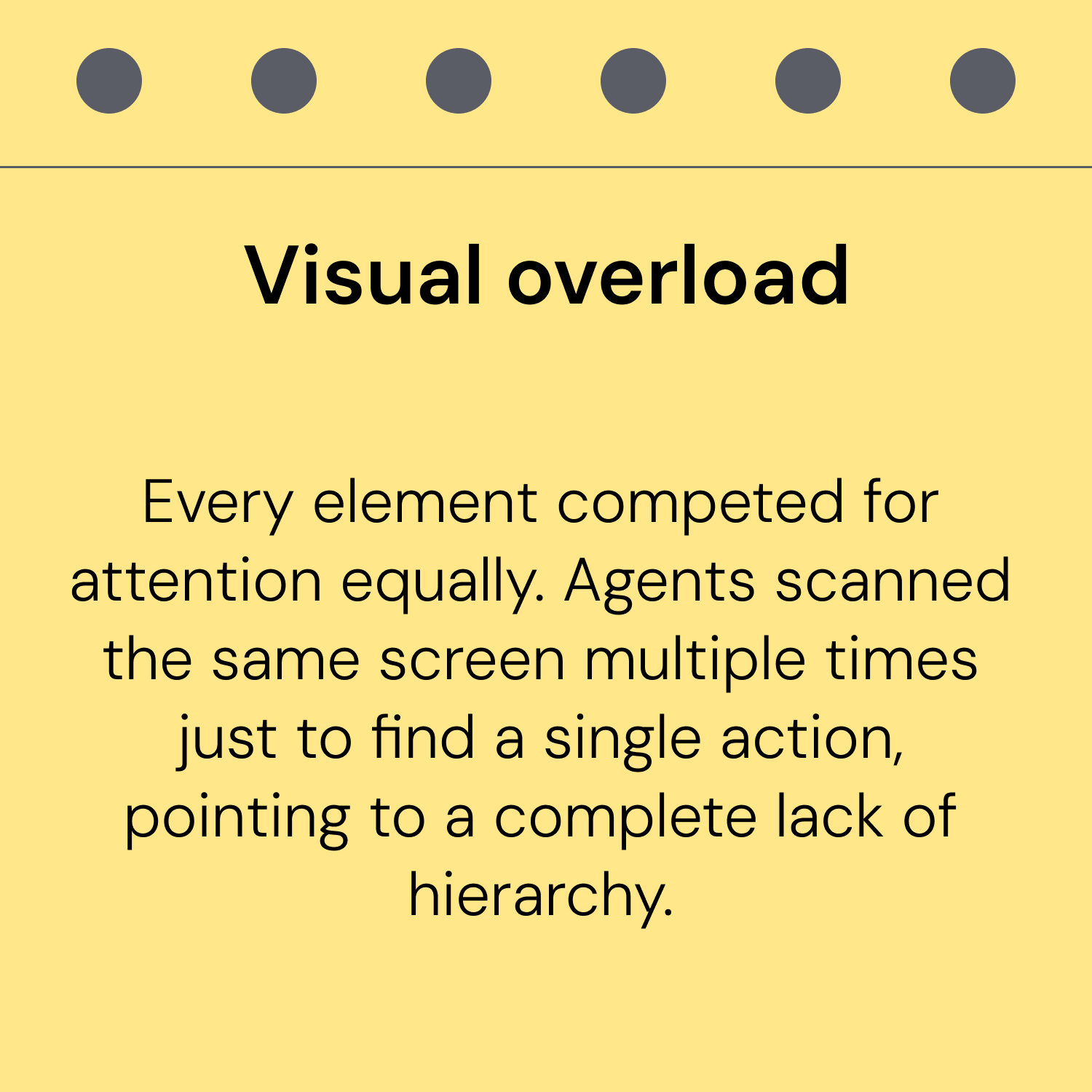
On the CX portal, agents faced an overwhelming interface with no visual hierarchy, making routine tasks like filing service requests feel harder than they should.

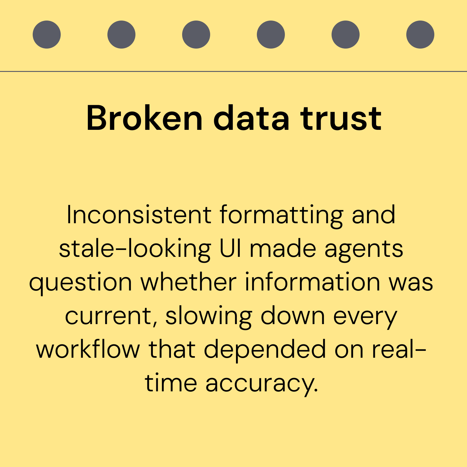
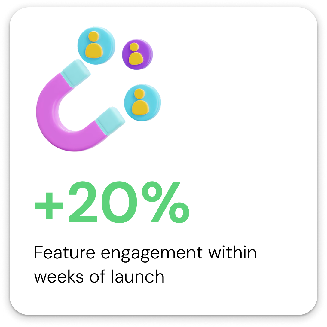
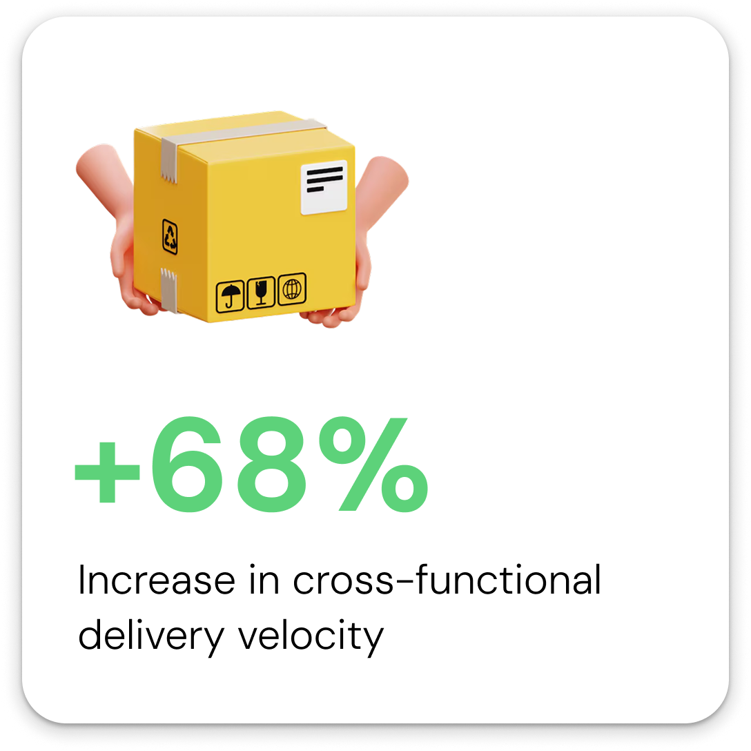
50+ user interviews and 15+ cross-functional working sessions revealed the real problem wasn't visual inconsistency, it was a confidence and orientation breakdown. Users didn't trust the information on screen, and no color system would fix that without first solving information hierarchy and workflow clarity.
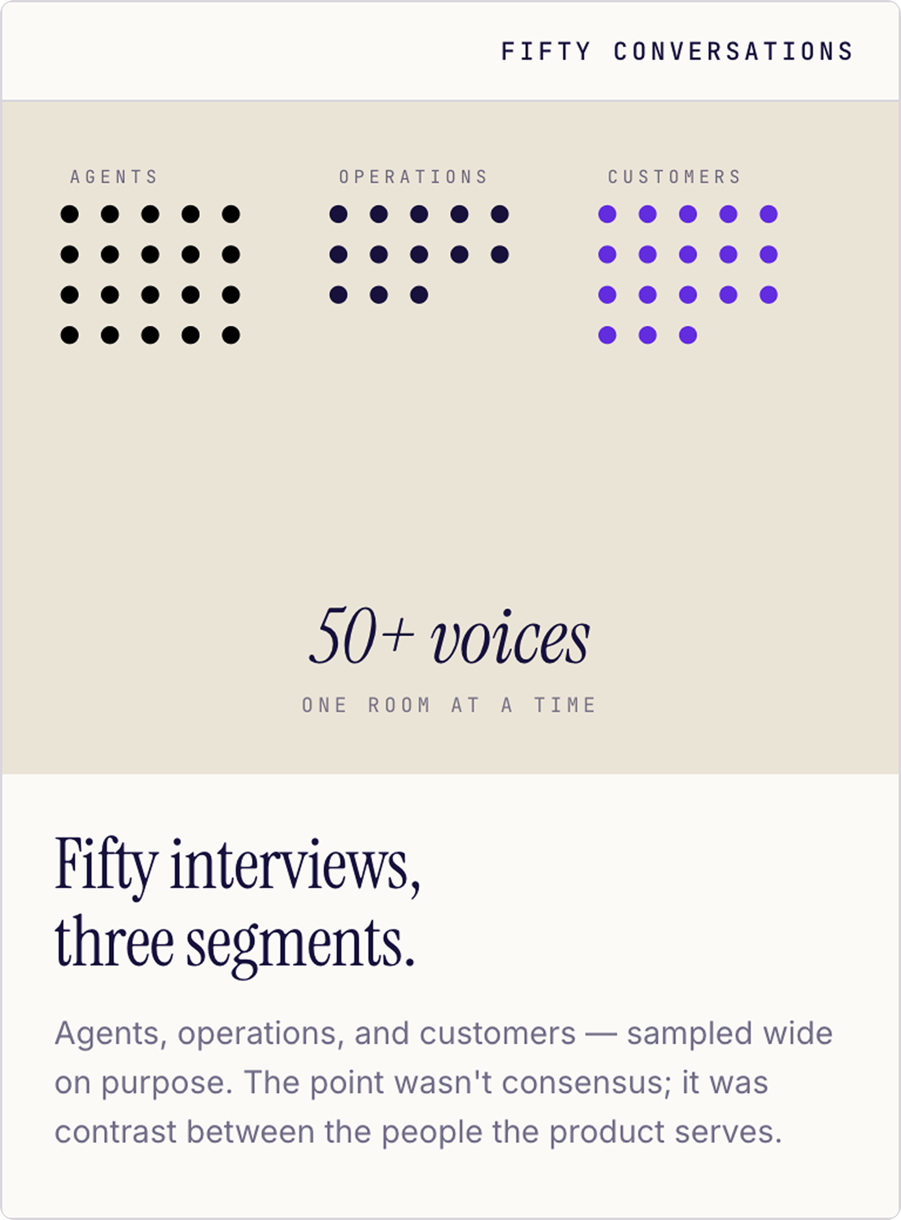
Five research sessions across agents, residents, and prospective renters revealed a consistent pattern. The product had the right features, but users couldn't find, trust, or act on them.