

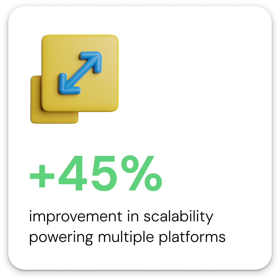
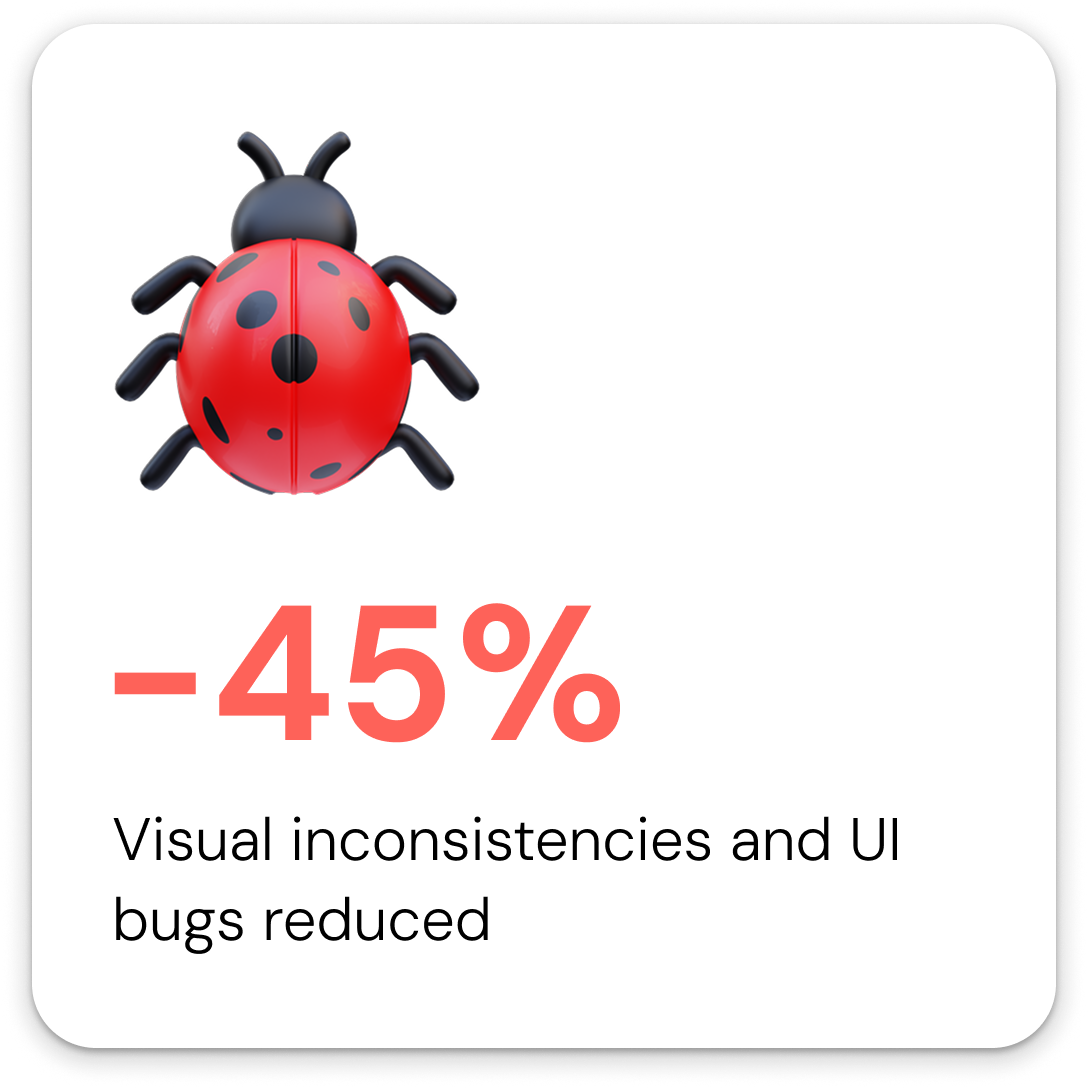
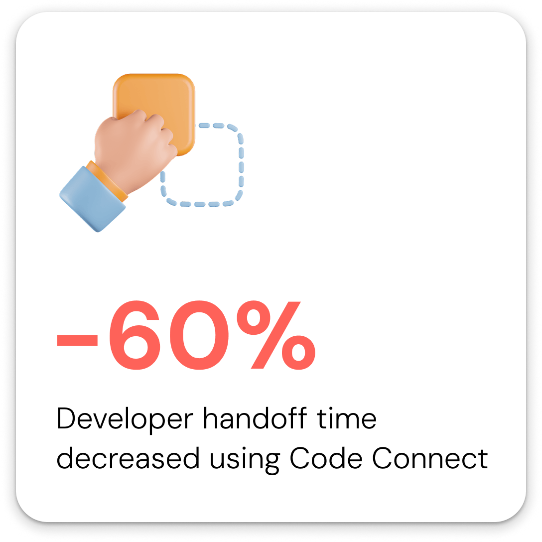
Fluidra operated 4 product surfaces (consumer mobile app, homeowner tablet, field technician display, internal CX dashboard) with no shared design language. Each surface had been built independently, creating inconsistent components, slow handoffs, and compounding visual debt across teams in 4 countries. I led the end-to-end design and rollout of Fluidra’s first unified design system in 3 months, building a three-tier token architecture from scratch. The result: design-to-dev handoff time cut by 60%, UI bug reports down 65% post-launch, and component reuse across surfaces went from near zero to covering 80% of core UI patterns.
Fluidra is a global pool and wellness automation company operating in 45+ countries, with IoT-connected hardware and software products serving homeowners, field technicians, and professional pool operators. I joined in 2023 as product designer on the consumer-facing app and, within 6 months, took on full ownership of building the company’s first unified design system.

Keeping the track of common component across other surfaces
Fluidra’s product suite had grown across 4 surfaces over several years, each built by separate teams with no shared design foundation. By the time I joined, the impact was measurable: developers were spending significant time per sprint resolving design ambiguity in specs, new components were being created independently across surfaces rather than reused, and the outdoor ICD display had never been formally included in any design process at all.
For a company operating at the scale of 45+ countries with teams distributed across 4 time zones, this wasn’t a visual polish problem. It was a velocity and maintainability problem that was getting worse with every new feature shipped.

.png)

The four surfaces and their primary users:
• Consumer mobile app – Homeowners controlling pool remotely
• Pool Professional mobile app – Pool professionals configuring equipments
• ICD (In-Can Display) – Field technicians configuring equipment
• CX Dashboard – Internal support teams monitoring equipment health
Every surface ran on different hardware, different resolutions, and different interaction models. They had never shared a component.


Before designing anything, I ran a 2-week discovery sprint covering three areas
I cataloged every UI component in use across all 4 surfaces.
What I found: the button component alone had 11 distinct visual variants with no semantic naming. Color values were hardcoded directly into components rather than referenced from tokens. Spacing values had no system, with 23 unique spacing values in use across just the mobile app. Typography was inconsistent across iOS and Android builds of the same screen.

My reaction when I saw the broken design components
I spoke with 16 developers across 3 teams to understand where the current state was creating friction. Three findings that shaped the entire system:
- Developers were regularly making independent color and spacing decisions when specs were ambiguous, causing QA failures late in the cycle.
- Handoff documents were being interpreted differently across the US and India teams due to no shared naming conventions.
- The 5-inch display had no documented design specs at all. Developers were working from figma designs.
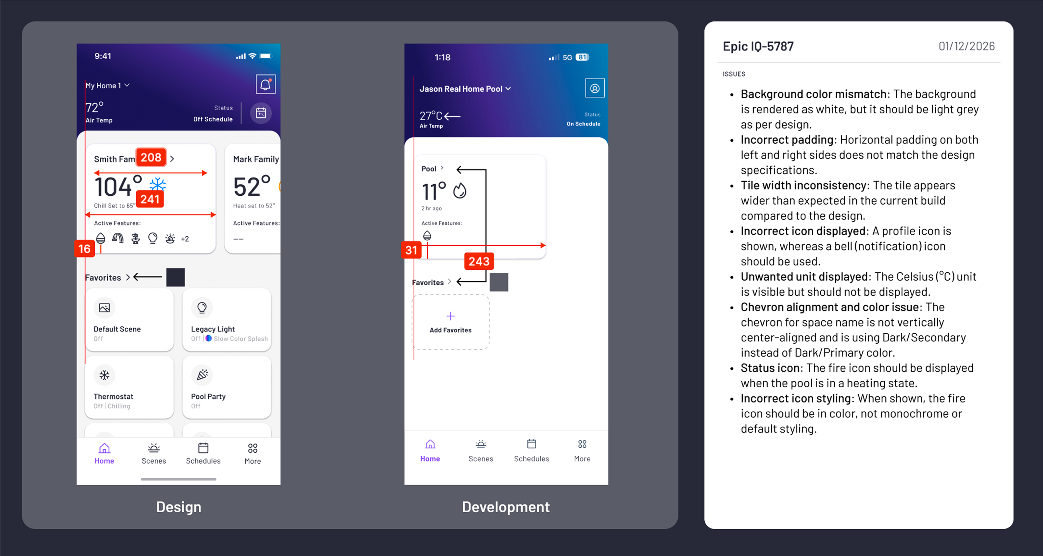
Screens are final QA/ Pre-release
I visited an installation site to observe the 5-inch display in a real environment.
The key insight: outdoor glare made several of the existing contrast ratios completely unusable in direct sunlight. This made accessibility a structural requirement for the system, not a polish pass.

A field visit to understand the system from the ground up
Before any token was named or component built, my team and I aligned on four non-negotiable principles:
- Accessibility is structural, not cosmetic. Every component would meet WCAG AA contrast requirements by default. Nothing ships if it fails outdoors in direct sunlight.
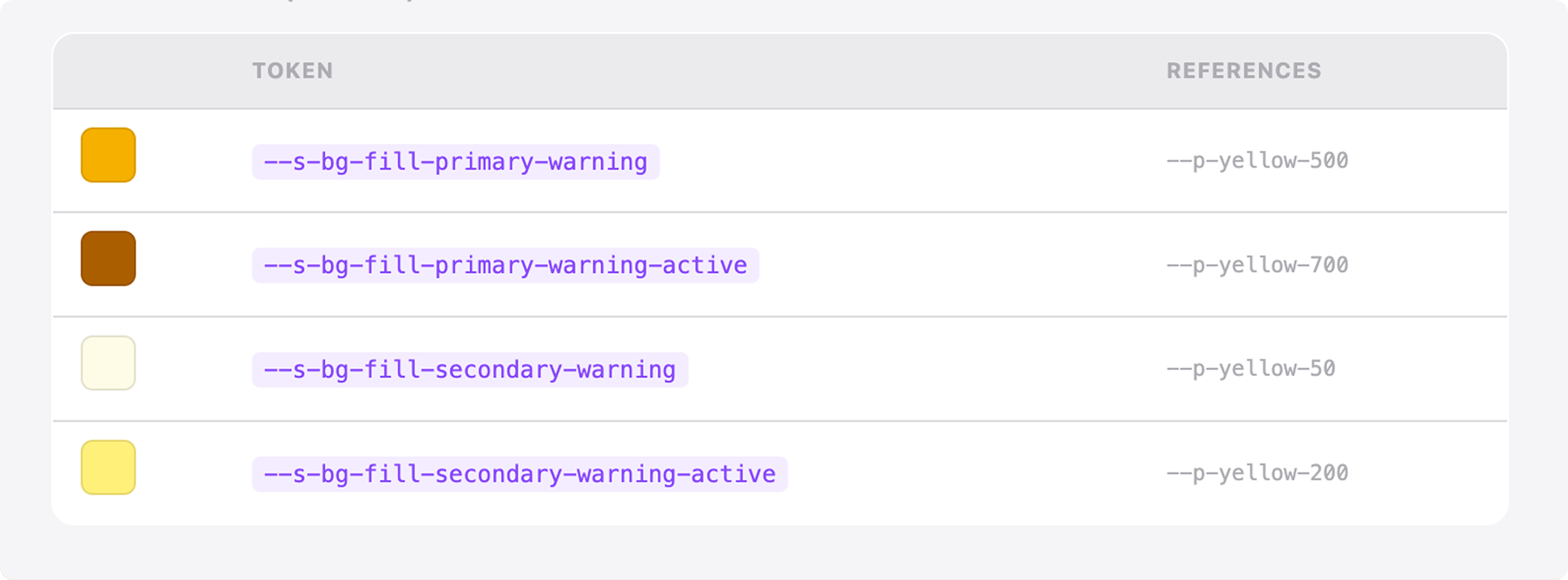
- Tokens over hardcoded values, always. No designer or developer would ever write a raw hex value or pixel value in a spec. Every value references a named token.
- Platform flexibility within shared constraints. The iOS consumer app and the field technician 5-inch display are different contexts. The system had to support product-level customization without breaking the underlying foundation.
- Developer adoption is a design problem. If engineers didn’t use the system, the system didn’t work. Every decision considered implementation friction.

Analyzing gaps in the Design System with my colleague
I evaluated three structural approaches before commiting:
Option 1: Flat token system. Fast to build, easy for small teams. Rejected because it couldn’t support the product-level theming differences between the consumer app and the 5-inch display without creating redundant token sets.
Option 2: Atomic Design (atoms/molecules/organisms). Well-documented and widely understood. Rejected because the abstraction layers added overhead for a system with 4 clearly bounded product surfaces and small design teams per surface. Atomic works better for larger design orgs with more contributors.
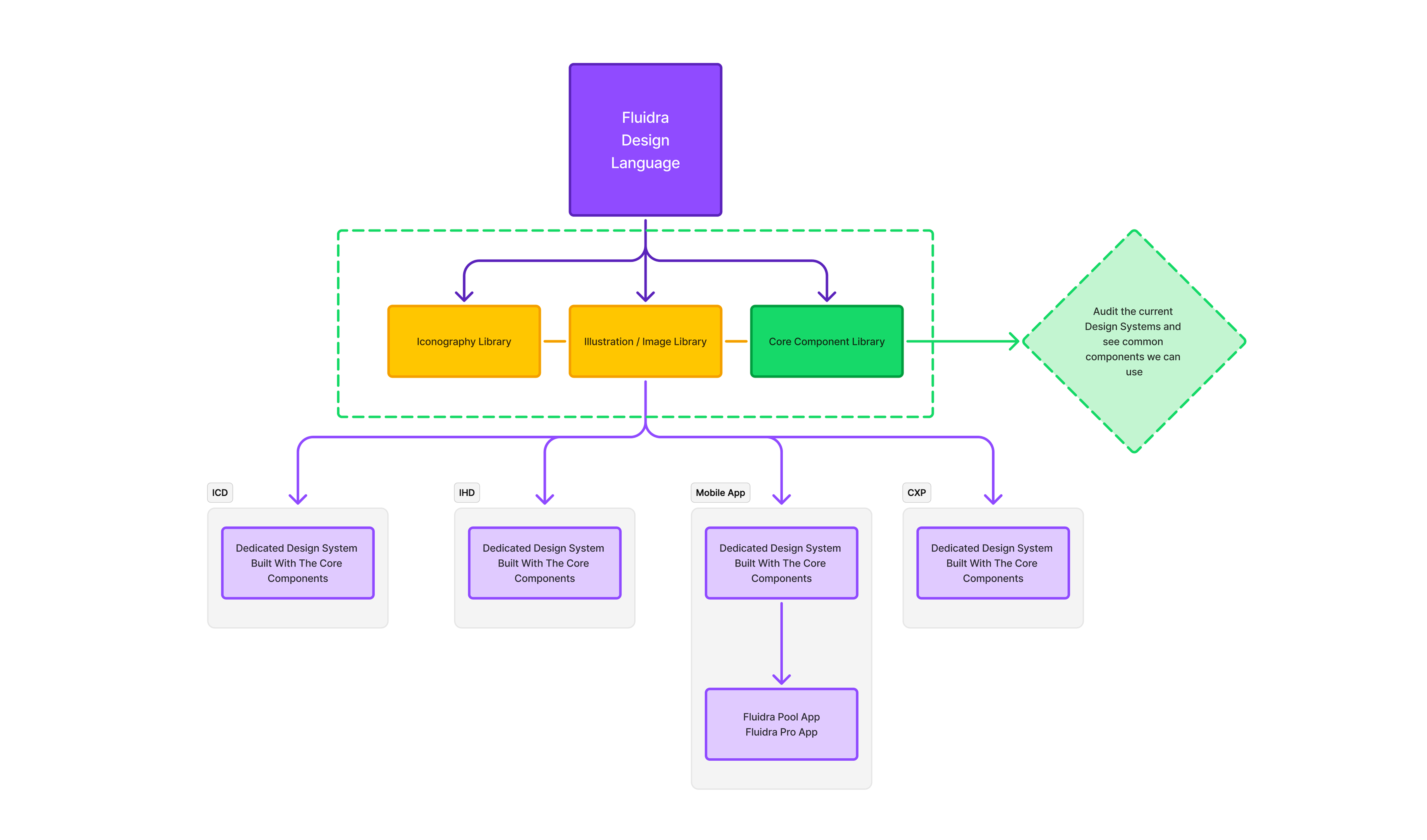
Option 3: Three-tier (Primitive / Semantic / Component). Chosen because it gave us a stable foundation that could be updated globally while still allowing each product surface to customize at the component layer without breaking shared values.
Design System New Architecture
Why Three-tier (Primitive / Semantic / Component)?
The three tiers in practice at Fluidra:
• Primitive layer: Raw values. color.blue.500 = #0057FF. No context, just truth.
• Semantic layer: Meaning. color.action.primary = color.blue.500. Now that blue has a job.
• Component layer: Context. button.primary.background = color.action.primary. Now the button knows what it is.
This separation meant we could change the entire brand color from blue to teal by updating one value in the primitive layer, and every surface would update automatically.
Primitive Tokens Layer
Sementic Tokens Layer
Component Tokens Layer
1. What to keep in mind when creating a Design Token?
We adopted a context-first naming structure
2. Provide as much context as possible
The rule we enforced: names should be long enough to be unambiguous, never shortened for convenience. Tokens are read by developers, not users. Clarity costs nothing.
For example: $colors.background.button.primary.hover
3. Use modes for platform variations in Figma
Rather than maintaining separate token files per platform, we used Figma’s variable modes to define iOS, Android, and web variations within a single token structure. This kept one source of truth and eliminated the divergence problem that had existed before.
4. Use Figma MCP / Code Connect for easier dev handoff
The single highest-ROI process change wasn’t a design decision, it was a tooling decision. We implemented Figma Code Connect to map design tokens and components directly to code references. This meant developers saw component names, token values, and implementation notes directly in inspect mode, instead of interpreting intent from static specs. QA catch rate on UI bugs improved measurably in the first sprint after rollout.
Three months is tight for a system of this scope. I sequenced the work in three phases:


Shipping the system was the starting line, not the finish line. We established a lightweight governance model to prevent the same fragmentation from re-emerging:
