

.gif)
Turning user frustrations into actionable solutions

Once the insights were clear, the real transformation began. Redesigning the app wasn’t just about improving its appearance. It’s about creating an experience that works with the brain, not against it.
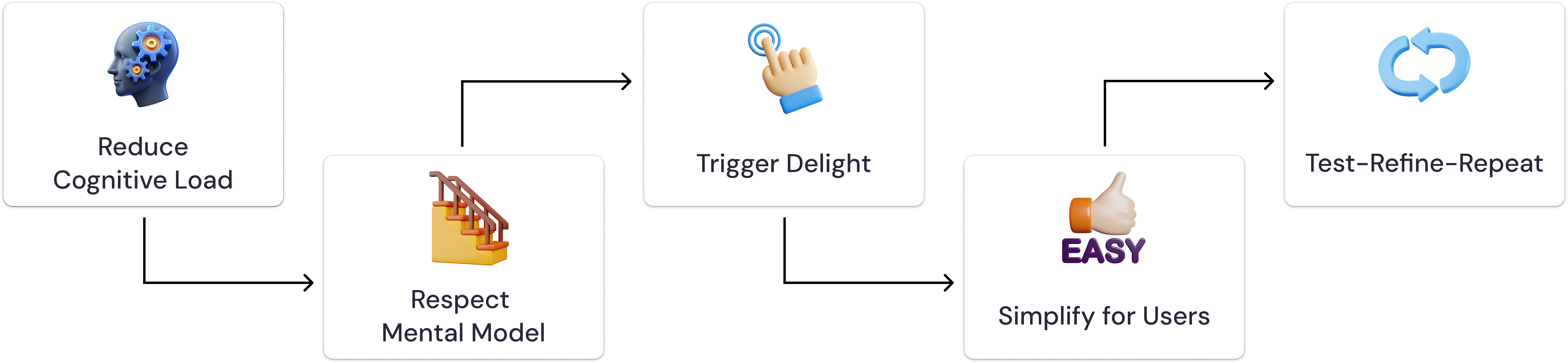
- Simplified the interface by reducing visual clutter and organizing related information into clear sections.
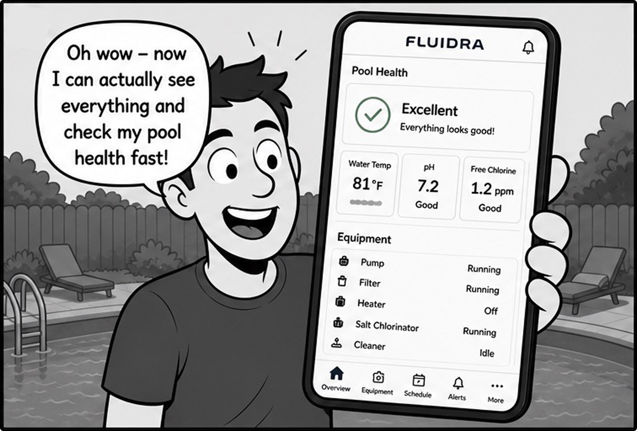
- Used status-aware tiles and color indicators to help users understand system health instantly.
- Prioritized key actions and controls, making important tasks easier to find and access.
- Reduced mental effort with a more scannable layout that improved usability and decision-making.

Users naturally rely on familiar patterns. By designing navigation with clear entry points and predictable flows, the experience became more intuitive, helping users move through the app with less effort and confusion.
Smooth animations, responsive micro-interactions, and intentional visuals do more than enhance aesthetics. They create moments of delight that trigger small dopamine boosts.
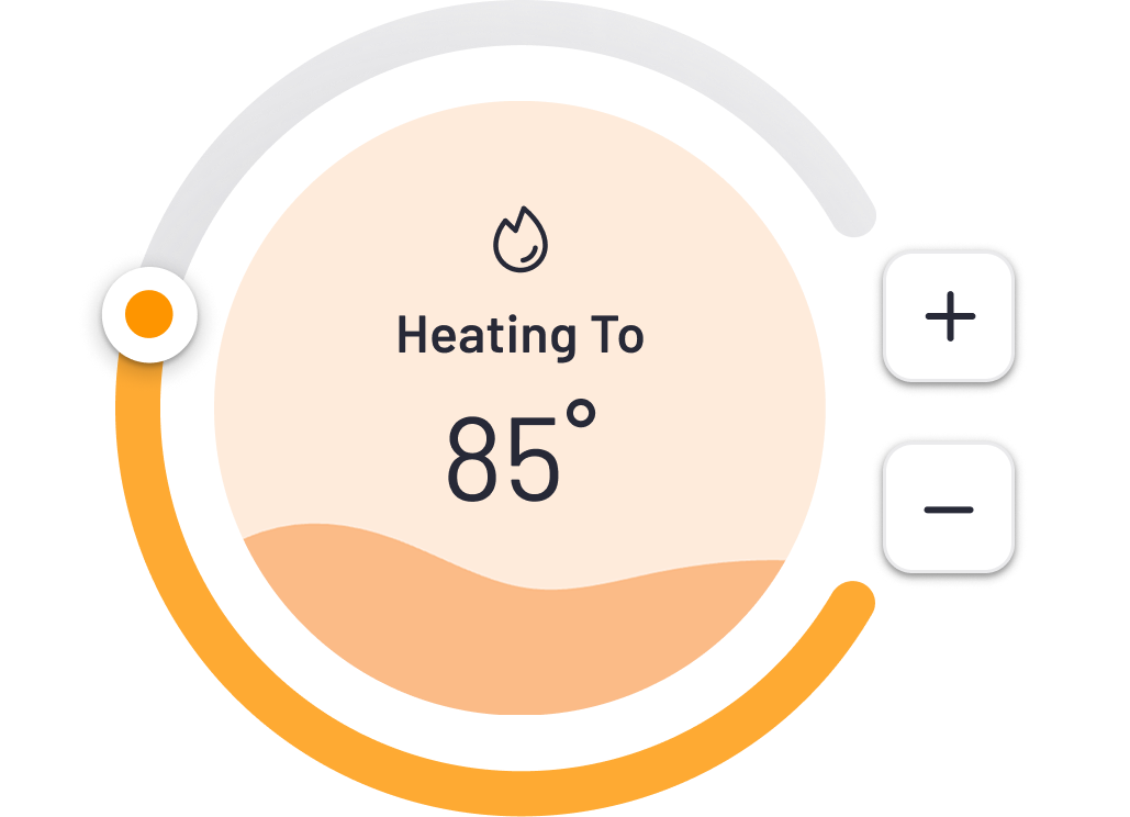

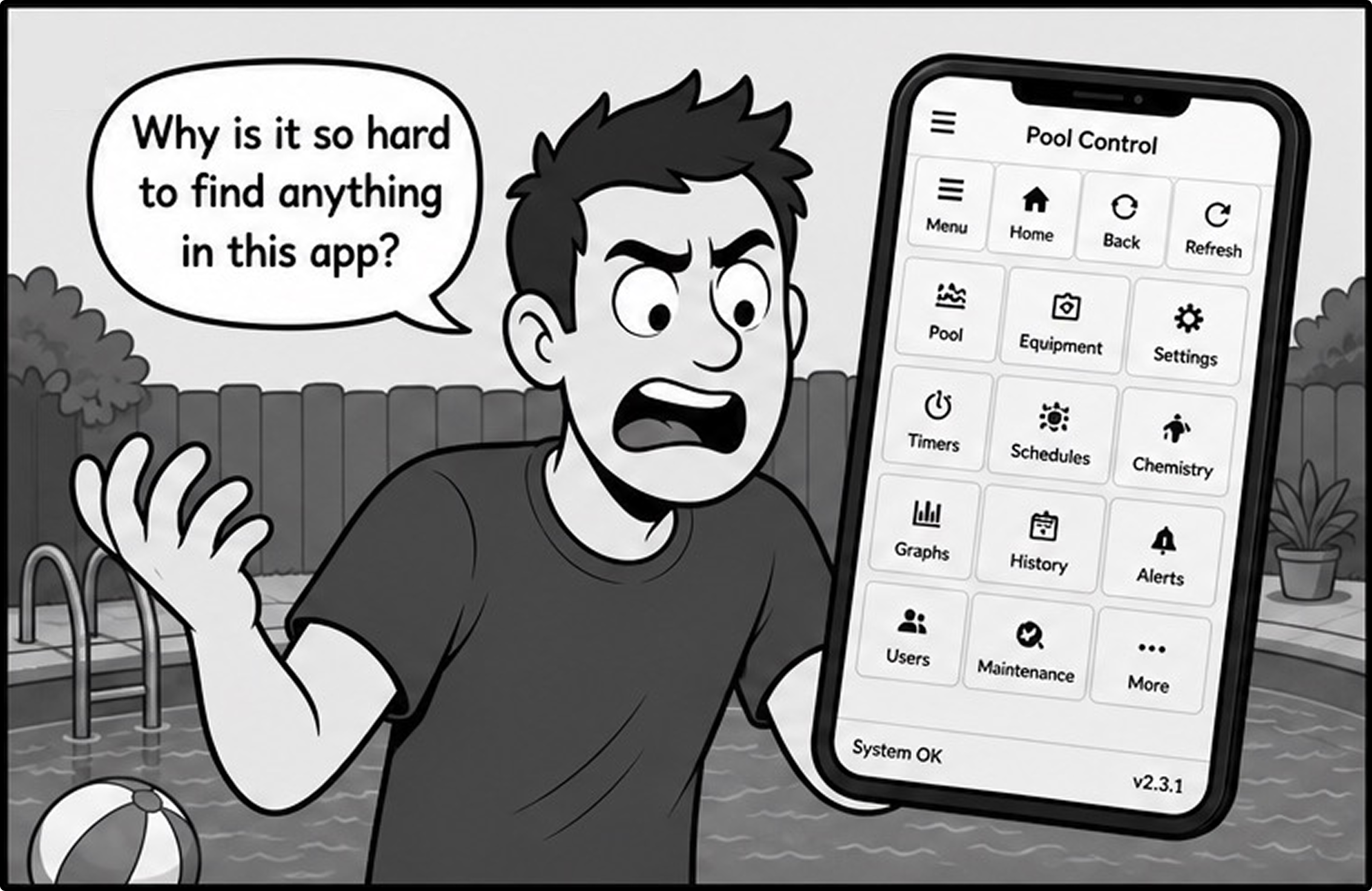
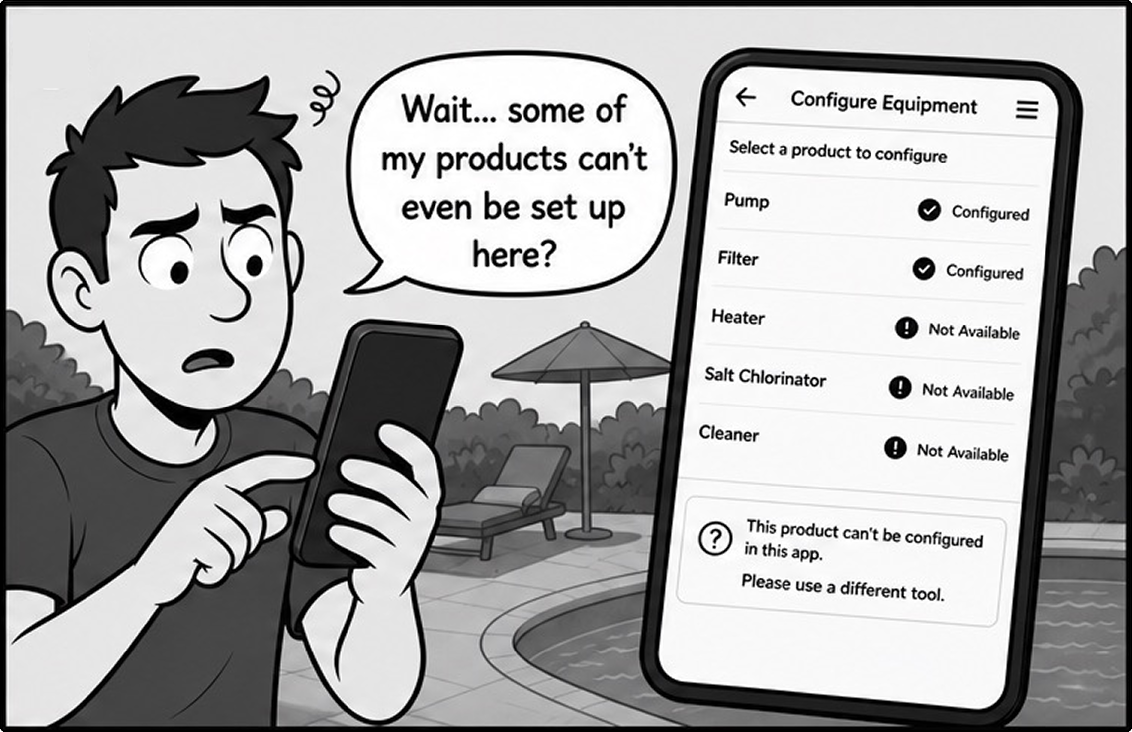
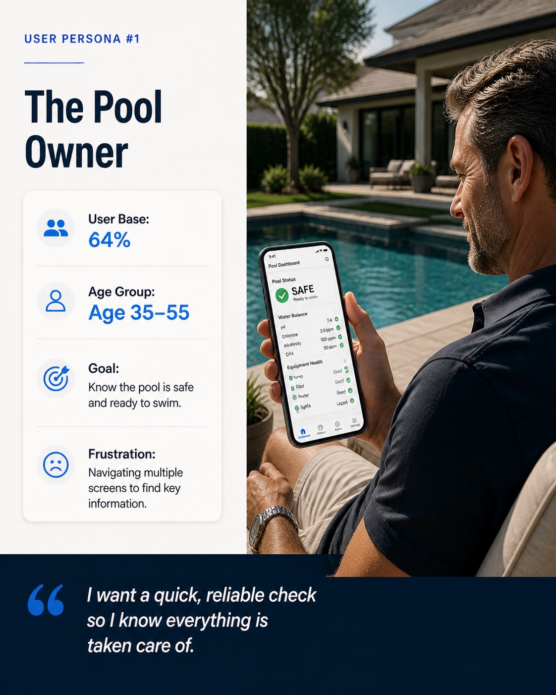
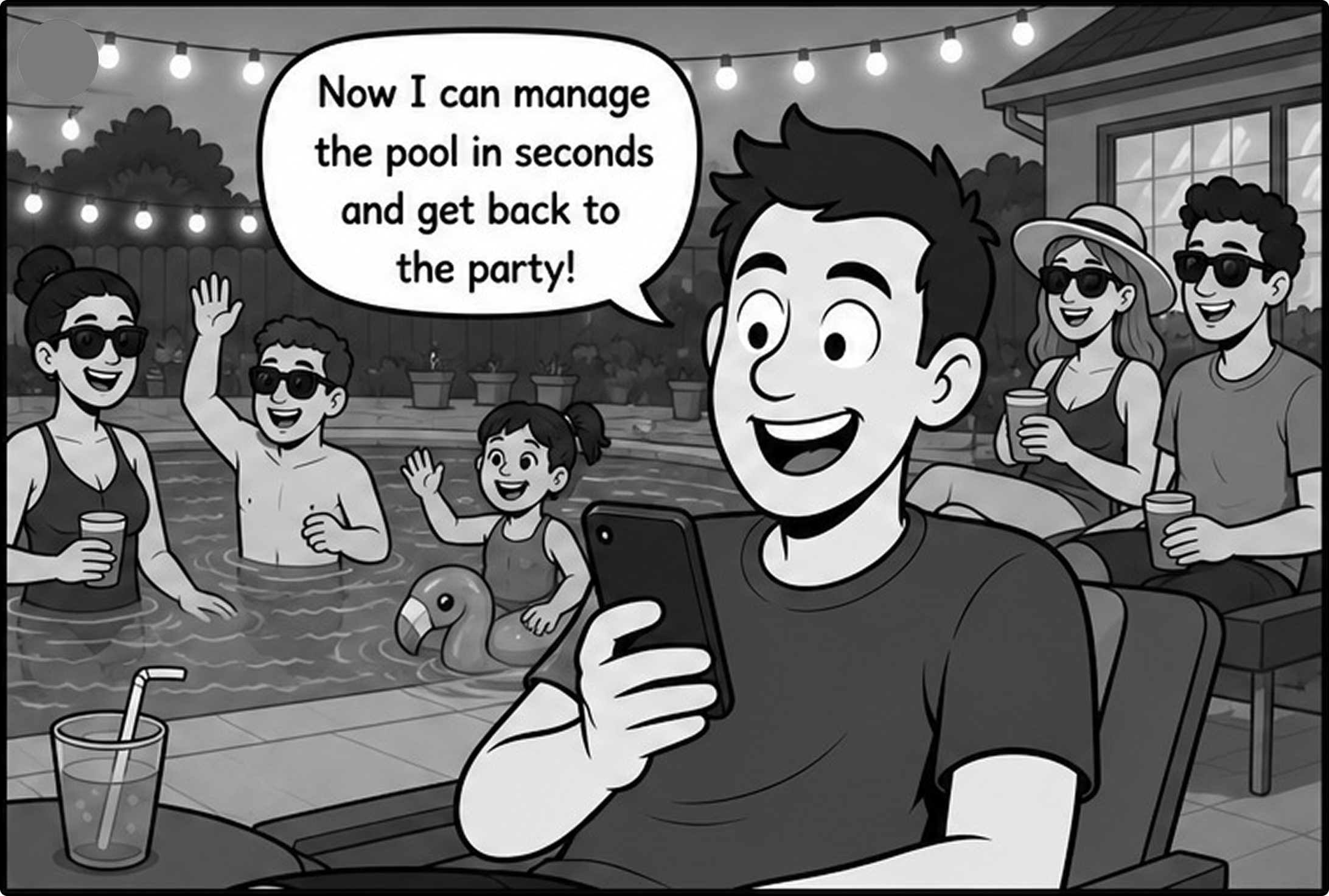
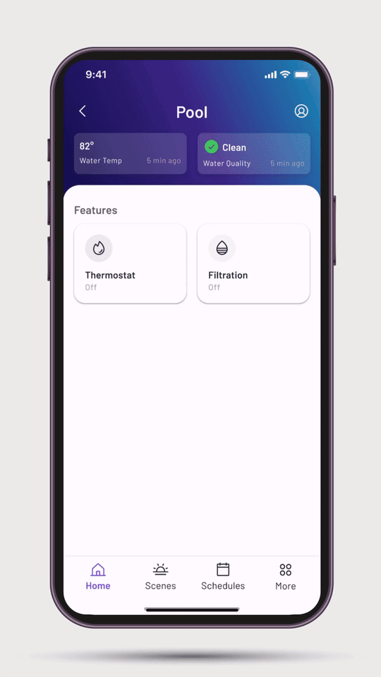
Fluidra pool users didn’t need technical knowledge to manage their pool.
Creating a pump schedule on Aqualink RS required 11 taps and knowledge of equipment cycle rates. By pulling equipment specs from the device API and pre-populating defaults, we reduced required inputs from 9 to 5.
Task time 2min 14sec to 43sec in usability testing
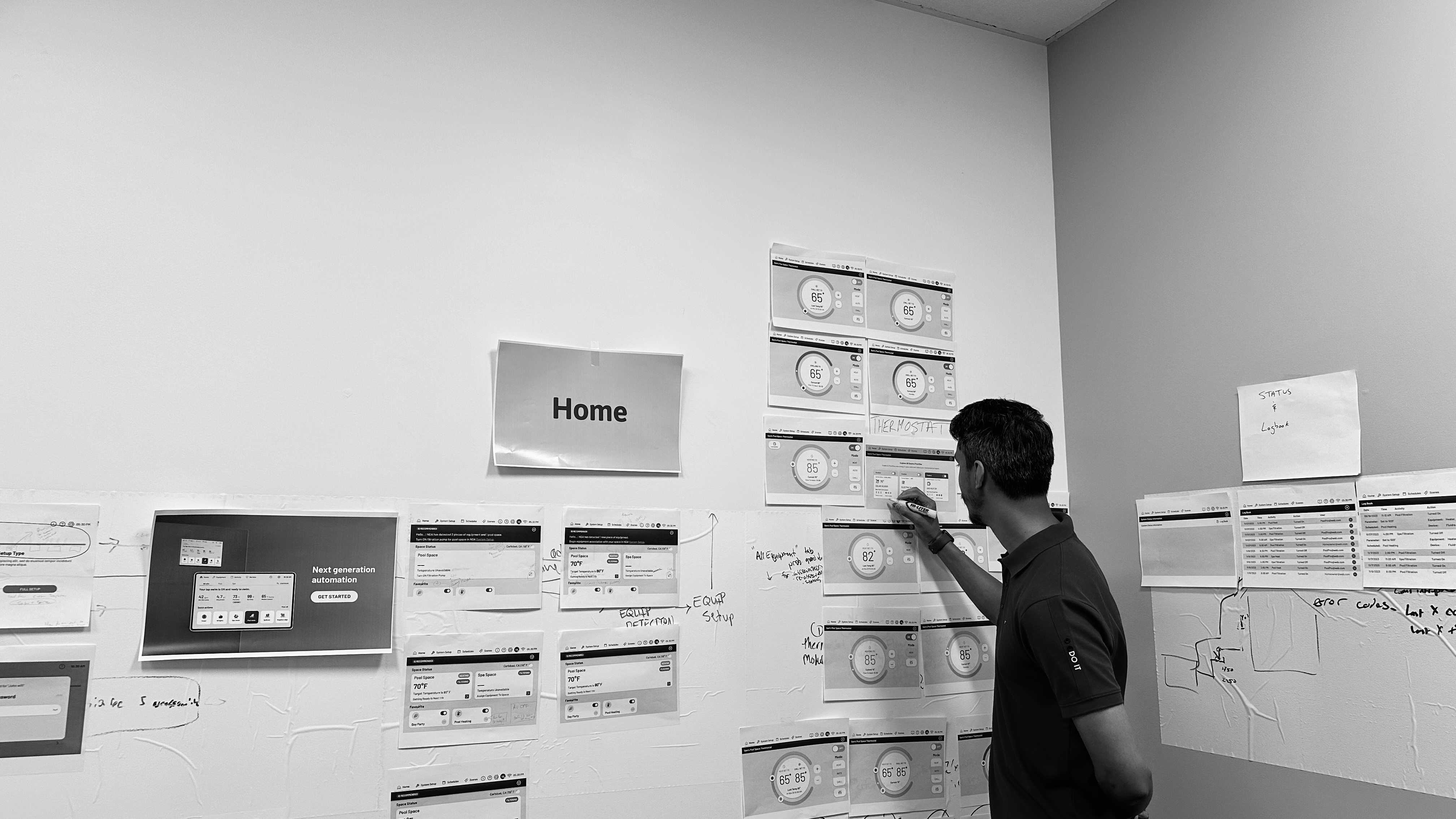
We followed a Test–Refine–Repeat approach to continuously improve usability and performance. User feedback and usability testing helped identify pain points in navigation and workflow efficiency, which guided iterative design refinements. By repeating this cycle, we created a more intuitive, streamlined experience that better aligns with user needs and business goals.

The tokenized component system shipped to production is now Fluidara's design standard across all digital product lines. The system reduced new feature design to handoff from 3 weeks to 5 days for for the product team. What started as a consumer app redesign became the infrastructure for Fluidra's entire digital ecosystem.
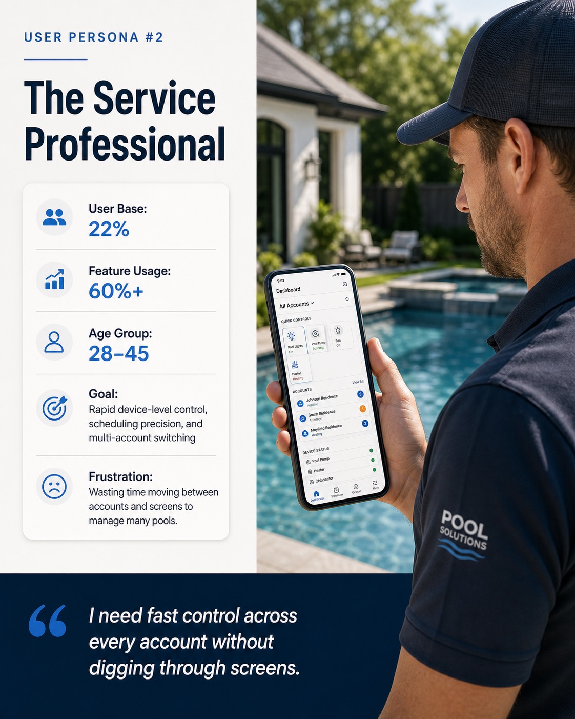
In hindsight, I should have run a dedicated beta with a power-user cohort, Service Professionals managing multiple pools, at least 3 months before general availability. The onboarding drop-off we saw in week 1 among this segment was predictable from the research data we already had. I treated it as a general usability problem when it was actually a segment-specific transition problem.
I'd solve it differently now: parallel rollout with a dedicated in-app migration guide for Pro users.
We deferred the token documentation sprint to V1.1, which cost the Spain team 3 weeks of rework. The lesson: governance and documentation must be co-designed with the system itself. Starting documentation in week 6 of the system build not after launch, would have saved that rework entirely.
Early in the project, the India and Colombia teams were reacting to designs rather than contributing to them. I introduced a rotating regional lead model for weekly critiques each region got ownership of one critique cycle per month. Contributions became substantially richer, and two of the strongest navigation insights came from the India team as a result of this change.